28 April 2018

a botanical study

Thursday’s second video from the online Sketchbook Revival class was presented by botanical artist Wendy Hollander. I’m a bit behind due to our recent trip to Galveston.

Rather than drawing the same subjects as Wendy did in the video, I drew our first rose of the season which is now wilting and darkening, forming a large rose hip. Most of the leaves of this antique rose variety are bright green but many of them are deep red with a greenish undertone.

I think they are as beautiful at this stage as they are when bright red and freshly opened! And the lovely old fashioned scent is just as lovely.

27 April 2018

Casa del Mar


I will be a bit behind in class work for the Sketchbook Revival online class, as we have come to the coast for a couple of days. This is the view from our hotel balcony — I drew it in the style Liz Steel taught in the “edges & shapes” class on Tuesday, sketching in paint and adding just a few ink lines at the end. I’m liking this technique!

I did use pencil guidelines to get the floor plan nearly right. Our room is more like an apartment; the hallways have ship-lath paneling and “windows” as well as what looks like outer doors, making it feel like beachfront property.

Been trying to catch photos of the pelicans Flying V-formation overhead this morning. They all seem to be headed towards Pelican Island, where we will be going later. Bill wants to tour the Navy Sub on exhibit there.

26 April 2018

sea birds


Today’s Sketchbook Revival class with Val Webb was amazing!

Unfortunately, we are on Galveston Island today and I left the needed art tools at home. So I just drew two of the birds I see here on the sea wall, using the tools I brought with me.

25 April 2018

first pages and warm-up exercise


Today’s first video in the online Sketchbook Revival class covered those “first page fears” as well as the “what should I draw?” quandary and warming up exercises. I chose not to follow along with the examples given — it’s supposed to be about having fun and I don’t enjoy random scribbling.

So I followed my own long-standing practices instead:

For years, I have drawn my art tools on the first page. This can be simply what colors I am currently using, as shown above, or a sketch of my palette, fountain pens or pencils. Usually there is a wonky line or smudge of ink or paint — the sketchbook is now no longer pristine and I can move on past that first page! (I also record personal contact info on the inside front cover, in case the book is lost.)

As to “what should I draw?”, I began the sketchbook habit in 2007 by following Danny Gregory’s Everyday Matters drawing challenges. This list really got me moving forward!

My favorite warm-up exercise is a simple continuous line drawing. I did so many of these back in high school art classes, some “blind” and some timed — they are really quite relaxing! I don’t do them every time I draw, but if I feel “stuck” they help. This drawing of two more of my tea cups finished up the small folded sketchbook I made for the first day of class — my own wee boring book filled with tea cups like Danny Gregory’s!

24 April 2018

shapes and edges


. . . and here’s my notations and class work for today’s second half, “Sketching Complex Shapes with Edges and Shapes” with Liz Steel. Liz is SO RIGHT — capturing shapes first is so much easier and quicker than beginning with lines!

a tea habit


Today’s first class in Sketchbook Revival was presented by Danny Gregory, a true hero in the sketchbook artist world. It was his book, Everyday Matters, that began this drawing journey so many of us are on. My response was to draw three of my own tea cups (okay, two of them are mugs, not cups — but I like BIG cups of hot tea!) Shown above is the tea I was actually drinking while watching the class video on my phone.


I’m using the simple folded journal I made yesterday using Bristol paper. This Scottie cup, given to me by my dear friend Ginger, looks very wonky but I was not using any pencil guidelines — just straight with ink in Lamy Safari fountain pens.


And this is my only real tea cup and saucer, unless you count some antique doll china that once belonged to Bill’s grandmother.

23 April 2018

a temporary sketchbook cover


After making two of the simple sketchbooks for the Sketchbook Revival class today, one folded and one a single sewn signature, I went ahead and sewed another book block from the leftover sheets of Cotman 200 lb. cold press watercolor paper. The paper is so thick, I used only one folded sheet per signature! But it should work very well for any wetter paint applications I might use.

Originally I had planned to do any class work in my regular current sketchbook journal, but because the first class was on making our own books, I decided to work in these books for the duration. The simple ones seen in my previous post are of Bristol paper, a smooth paper for pencil or pen and ink. This book block above is more for watercolor.

Eventually I will design covers for all three books but I really don’t want to decide on what they might look like today. So I needed a temporary cover to hold them:

This plaid book cover was made to hold paperback novels — I bought it because I love all things plaid but have never used it.

By tucking the front or back page into the inner flaps, my two larger sketchbook page blocks are easily held in place within the cover. The smaller folded book stays in place with the bookmark ribbon.

Seems like a simple temporary solution for some very simple sketchbooks!


some simple handmade journals


The Sketchbook Revival online workshop began today, with the first lesson teaching how to make three simple sketchbooks. I didn’t make the first example, an accordion book, because I had already filled two journals of that style, full of special memories.

The larger one, made by Cathy Johnson, was filled in March and June of 2013 during two of my “Granny Nanny” trips staying with grandkids. Across three pages of one side is Mikala’s gigantic Maine Coon kitten, Oreo — Sadly, he died of a heart attack near the end of that same year, making this sketch poignantly special. (That was also the year my husband Bill had a major heart attack, followed by bypass surgery. I am SO GRATEFUL that he not only survived but is still thriving with a strong heart!)

The smaller accordion book contains random sketches from 2015, including my cataract surgeries. I fill both sides of this style of book, using a couple of rubber bands to hold uncorked pages together as I work. Otherwise the book can easily spill across the floor!

The two books in front are a simple folded version of white Bristol and a single signature sewn book of the same paper, covered with a folded piece of vintage Bristol in a cream color. I think I’ll use both of these for some of the class work.

Two separate parts to today’s class were sent by email today; I’ve only watched the first one due to wimpy internet. Maybe I will be able to view the second half before bedtime.

22 April 2018

new sketchbooks


Even though I have a small stash of papers to bind my own sketchbook journals, I haven’t really been in the mood to get started on it. I also need to find a better quality glue before beginning on that project.

But for now, I am liking every Stillman & Birn sketchbook I’ve tried, especially the softcover versions. My current book is the deep blue Beta lying underneath this light blue Field Notes notebook that stays in my purse. And in the above sketch, two new books recently arrived by mail order: a Zeta landscape softcover and a Nova softcover with gray toned paper.

I still have nearly half of the Beta to fill, so there’s still time before I have to decide . . .

18 April 2018

time to re-ink


Some of my fountain pens were skipping a bit and some were nearly dry, so it was time to re-ink. I seldom completely clean a pen; inserting the nib and feed into the ink, then emptying and re-filling the converter a couple of times seems to lubricate everything. My pens then write like new again.

This old wooden box that holds my ink bottles (De Atramentis Document, Noodler’s, and J. Herbin brands) and a few pre-filled cartridges is from my grandfather’s print shop, and once held odd type, blocks, and bits for the monstrously big printing presses he kept in his garage. I can remember the smell of the ink he used a large roller to apply. His fingers were always ink-stained. As are mine after refilling my pens!

13 April 2018

flamingoed!


Our daughter-in-law Carrie recently had a birthday . . . and she woke up to find that her yard had been taken over by plastic flamingos!

(Flamingo pink is a very hard color to mix!)

11 April 2018

which green?


I have tweeked the limited palette that I recently put together, replacing the raw umber with burnt sienna — I can always mix a near-match to the raw umber with ultramarine. Then I wondered whether to keep the one single-pigment green as perylene green, or replace it with phthalo green BS?

So I mixed it with my other colors. If what I’m after is “bright”, the phthalo is a better choice; for subtle, realistic color, the perylene works better. . . . . Still undecided. What do you think?

The other choices in this limited palette are quinacridone rose, quinacridone gold, Hansa yellow medium, phthalo blue GS, ultramarine, burnt sienna, Payne’s gray, and a dab of white gouache. Plus a  Loew-Cornell #8 round and a 3/4 flat for my brushes. The flat’s handle has been shortened to fit the box and pointed for scratching effects.

09 April 2018

a cleaning day


I store tubes and sticks of watercolor in a deep drawer of an antique wooden toolbox, with paints already squeezed into pans and allowed to dry stored in a shallow drawer just above the paint drawer. Over time, it gets vary messy, though I dotry to keep the paints in roughly the same order as I place them in palettes. There were several colors that I’ve stopped using or some I tried due to other sketchers’ experiences — I decided to clean these out and settle on just the ones actually used.

Some of those on the right hand side are only used once in a great while, or only in a special granulated palette. So my “core” palette is usually made up with 10 to 14 of these. I will miss the old quinacridone gold (no longer available). I still have some squeezed and dried in pans. But it has been removed from the overall stash.

08 April 2018

my REAL Etsy shop


While I was at church this morning, another one of my prints sold in my Etsy shop. (Woo-Hoo!)

For those not “in the know”, this is what my real Etsy shop actually looks like! A large paper bag with handles, full of plastic-sleeved pre-matted prints, originals, sets of note cards, padded mailers, and the binder where I record inventory, expenses, and sales. Not so exciting, is it?

My Etsy shop online can be found here.

06 April 2018

just for fun . . .


Once again, I am on the road as “granny nanny”, helping get three grandkids to and from school while their daddy drives the Needville Welding Team to a competition in Corpus Christi. (Welding team? Who knew schools had such a thing!?!)

Earlier this week, their mother celebrated another birthday; last night everyone tried to hit and break a piñata in her honor. Tons of candy and confetti fell out, along with this rubber ducky. So I tried sketching it, using watercolor as gouache by adding white gouache to regular watercolor. Seems to act just like regular gouache paints. 

I’m also running LOTS of updates on my lap top. I no longer have WiFi at home so whenever I am at our kids’ homes, I borrow their WiFi to update. Any offered internet where our cabin is located has terrible reception due to hills, valleys, and tons of trees. And being 12 miles from town, the larger companies aren’t that interested in providing to such a small population.

05 April 2018

Macy


Normally I feel a bit too intimidated to sketch people at church. Besides, we sit up front where I only see one family plus the pastor — and he changes expressions too fast to capture!

But last night I was jotting down notes and between that, I just started drawing Macy, our pastor’s beautiful granddaughter. She has the most gorgeous face, classically beautiful like Audrey Hepburn. And she’s tall (15 years old and over 6’) yet moves with such grace! Very athletic too.

04 April 2018

window view


As I sit inside our cabin watching the carpenter’s crew struggle to place an overhead beam for our new carport, this is the view out a different window. Sketched in De Atramentis dark blue ink with Daniel Smith’s lunar blue and a touch of other watercolors.

The hummingbird feeders are filled and ready; so far we have only seen one this year but the levels are dropping so they must be feeding when we aren’t watching for them.

(Anyone notice something missing in the sketch? I didn't until after posting this here and on Facebook: the sky peeking through the oak trees was brilliant cobalt blue . . . and I forgot to paint it!)

02 April 2018

a minimal kit

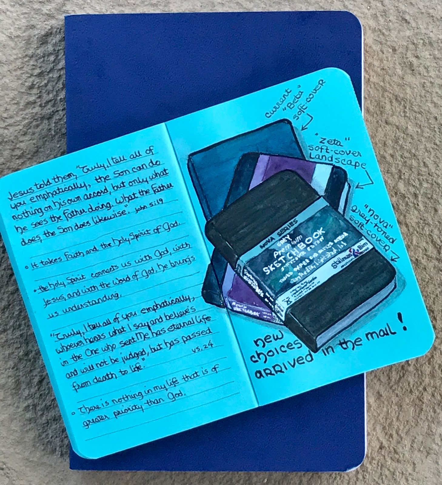
Although I am still working in my larger (5 1/2 x 8 1/2”) Stillman & Birn Beta sketchbook, there are times when a smaller one comes in handy. Sometimes I might wish to carry a smaller bag, or maybe just stick stuff in a pocket and carry no bag.

I had one more Field Notes notebook from the set of three I purchased over a year ago, and the robin-egg blue just feels like spring, so I decided to start working in it as well.

To be truly minimal, I can just carry the wee notebook and a couple of pens: a Pentel Pocketbrush pen and a Sigma white gel pen. Color, if desired, can always be added later at home.


Having purchased a sample of QOR “earth color” watercolors years ago which I put together in an Ice Chips tin, I decided these might work well on this toned paper as the QOR paints seem a bit more opaque that my normal Daniel Smith watercolors.

A second lid friction-fits on the bottom to provide more mixing space. A bit of folded paper towel fits inside here as well.


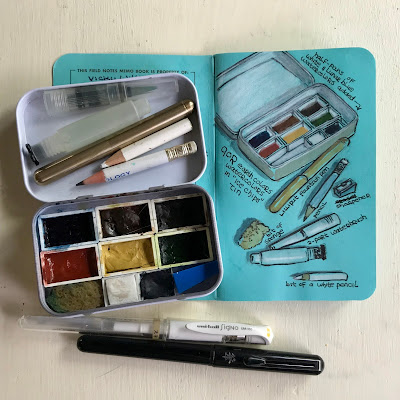
I've added small pans of white and lunar blue watercolors to the set. Also fitting inside the box are my tiny Kaweco Lilliput fountain pen, 2 shortened pencils (one a white Prismacolor), a pencil sharpener, a two-piece water brush, and a bit of sponge.

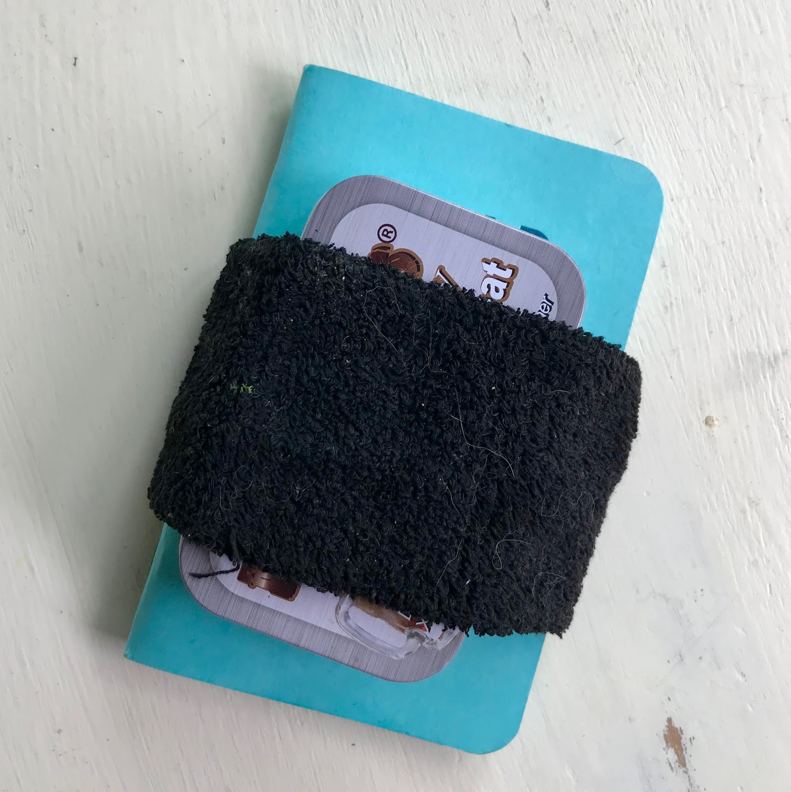
A tiny card showing the QOR colors also fits inside the friction-fit lid on the bottom.

The whole thing can be held together using a terry-knit wrist band, which can also be used for wiping the brush on.


Related Posts Plugin for WordPress, Blogger...